

Sunday, 13 February 2011
ARTIST COLLABORATION- PERSONAL WORK.
This most recent piece of work is a collaboration with a friend of mine Ben Hansen who is also an illustrator. We started off by both thinking of a word each and came up with 'Teeth' and 'Monster'. He started off the drawing on the left of the page and wrote the text 'Teeth'. I then carried on the drawing on the right and added the text 'Monster'. I decided to mainly use my brush pens for this piece and for the detailed parts I used a biro pen. Our aim is to create many of these drawings and either sell them as screen prints or collect them as a booklet to sell.

BOBBLE- PERSONAL WORK
Humour is a major influence in my work. I think it's a great way of grabbing peoples attention and it doesnt make the public take your work that seriously. For this drawing I was influenced by lyrics from a song by the band Wild Beasts. Music is also a big influence in my work and I enjoy creating drawings which tell a story. Although some of the lyrics I am inspired by may be dark, I like to create a funny and colourful image out of it.


CRYING LIGHTNING- PERSONAL WORK
This piece of work is influenced by Arctic Monkeys lyrics from their new album 'Humbug' which involves alot of dark, mysterious lyrics. As soon as I heard this line I was eager to draw something matching the words and album. I have created many other drawings which were influenced by this album and may even create a booklet out of it. I also tried out a new shading technique of lightly crosshatching the darker parts.


SKETCHBOOK WORK AND IDEA GENERATION
Here is a few examples of my sketchbook work and idea generation. I prefer working on large sheets of paper, that way I have alot of room to spread out lots of images and note down ideas. Im interested in the process of exploring with pen and paper and see what i can pull out of that. Im really into sketchbooks but I dont work in sketchbooks quite as much as I used to because it eventually got to the point where I wanted to start tearing the things out but the sketchbook seemed too sacred so decided to abandon that idea. Although I do like sketchbooks as it allows you to generate ideas and explore and i think thats the biggest theme my work involves.


HAIRY HOWDY- PERSONAL WORK
I drew up this idea months ago and was pleased with the idea but I thought I could have drawn it much better with more detail. A fellow friend of mine who is an artist advised me to draw it up again in a 0.1 fine liner pen with much more detail , so recently I took the original image to my lightbox and re-drew it with much more extreme detail. I presented it to the public again and it seemed to be much more popular, this has made me realise if I'm ever unhappy with a drawing I should try and draw it up again in a different style.


SLEEPLESS GEORGE- MUTATION PROJECT
For this project the subject was 'Mutation' and the task was to produce a small comic on it.
The tutors didnt want the generic things linked with mutation such as zombies, monsters etc.
So I decided to base mine on sleep deprivation. I didnt want to set my comic out like the cliche
comic in squares, so I spread it out with basic text and image. Instead of a script I decided to
use a poem I knew by the band 'The Maccabees' called 'Sleepless George' which is about a boy who
is deprived of sleep. I wanted to the pages to be quite crammed to show the stressful side of sleep
deprivation and I used colours which I thought were dreamy, pastel colours. I was very happy with the
outcome and it seemed extremely popular with the public.

]


MY EMPTY HEART- PERSONAL WORK
I drew this image back in college for my 'Talking Heads' zine ( Image 1). I liked the idea I came up with but wasn't happy with the layout and colour of it, so decided I'll change it in some way. I had recently bought some new brush pens and wanted to experiment with them, so i re-drew this image to make it look almost 3-d. Iam happy with the outcome of this and may even make prints out of them to sell.


LINE DRAWING- PERSONAL WORK
Recently I've started using this detailed line drawing style. I usually use either a fine liner or a standard biro.


MATERIAL EXPERIMENTATION- PERSONAL WORK
Here is some of my personal work. Since college I've been drawing these ghost like characters. They tend to crop up in certain parts of my work so they're almost a signature of mine. Ive started using this style of fine line with brush pens which I think flows together really well. I've also started experimenting with different materials not just plain paper. On the both of these images I've drawn on used envelopes and I think the colours on both pieces really compliment each other.


HANDRAWN TYPOGRAPHY
In college I never really seemed keen on typography but discovered recently it doesnt just have to be designed on the computer, it can be handrawn. Since then I've been playing around with certain type faces now and again with brush pens, fine liners and screen prints..


LOGO DESIGN PROJECT
Logo Design was a project to create a logo for a company which you have made up. I chose to design a logo for a company called 'Bloc' which I decided would be a skateboarding clothing business. Below are some thumbnails and idea generation. I wanted the text and image to be inspired by the company name so started drawing some ideas which were quite square and block like. In the end I chose a square logo which I drew first hand and simple, bold text. I was very happy with the outcome of this idea and it openend up alot my skills on the computer program Adobe Illustrator.


RETRO POSTER DESIGN
Retro poster design was a project where we were given several retro poster styles such as Propaganda and Pop Art and various companies to base the design on e.g. Ferrari, Swatch, Coca Cola. I chose Peroni Beer and aimed to design it in a Saul Bass way. I researched the charcater uses and drew it in my style. After creating my character I began thumbnailing ideas and researching into the Peroni company. On the website their tagline is 'Brings Out The Italian In You' so i kept this in mind and drew more thumbnails. My final idea is of my character drinking the Peroni Beer and gradually his body is filling up with the Italian flag. I recieved good feedback in the class criteria and changed little bits for the final design.


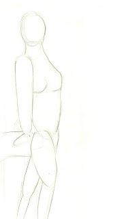
LIFE DRAWING
In college we had drawing classes every 2 weeks. During these classes we sometimes took part in Life Drawing. I had rarely drawn from observation and I think these classes helped alot. In my opinion I didn't think I did that well but I did try my best. I think these classes did help because in my personal work I do in a way draw from observation as I observe members of the public or certain charcaters and mould them into my style. I'd love to take part in life drawing classes again as I think it will build up my strength and confidence in drawing observationally and will defiently help in the future.


THINKING WITH TYPE- TYPOGRAPHY POSTER- LIVE PROJECT
Thinking With Type was a live project where we were asked to design a poster promoting the new release of the typography book. We had to design our own type face and then use it in the poster design. I came up with a square, block type which when I designed started to congeal together so for the final poster I made all of the letters wrap around. I was quite happy with this design as I had never experimented with type or even designed it before. If I'm being honest, I wasnt very happy with the outcome of this poster. If I was do this project again I would probably try out a handmade or handrawn type as I think that would suit me better.


BEANEY MUSEUM- LIVE PROJECT
This was a live project where we were asked to design a poster for a local museum which was being refurbished and made much modern to attract people of all ages. The tagline for the poster was 'Hungry For Heritage' as it was being funded by the Heritage Lottery Fund. I had one major inspiration for this project which was the artist Ralph Steadman, I have loved his work ever since secondary school. The way he uses splatters is so unique and even though it may look messy there is so much perfection in his work. From drawing classes in my Graphic Design class we were set a task to use photos from the Beaney building and create a collage out of them. I enjoyed this task alot and used the idea for my final poster. I scattered collage of the Beaney at the top of the page with tentacles feeding the 'public' parts of the museum. At the final crit the company loved my idea and gave it alot of praise but just didnt think it was suitable for the museum.


NARRATIVE IMAGE MAKING
We were asked to choose a well known fairy tale and put our own spin on it. I decided to go with 'Little Red Riding Hood'. The style of art I was influenced by in this project was comic book art. Especially the work of Frank Miller who had drawn and written the 'Sin City' comics. I first discovered his work from the 'Sin City' film, from then I've collected most of his books. His style of drawing in Sin City is very film noir and he only paints in black and white, some of the images he creates seem to baffle me as they seem almost impossible to immitate. This project really strengthed my drawing skills observationally and has made me use many different materials and techniques to create the perfect atmosphere.


TALKING HEADS ZINE- FINAL PROJECT
Whilst studying Graphic Design at Canterbury College I never really had the chance to use my illustration skills but when this project came up I was very excited to start it. For this project we were allowed to choose what our project was going to be based on. I chose to create a fanzine on certain charcaters, settings and poems and named it 'Talking Heads'. This project was really a breath of fresh air for me as I never had the chance to use illustration and I learnt many things along the way as it was my first fanzine that I had made. During the project I recieved some advice from my tutor who is a childrens book illustrator so she had alot of knowledge in this field. I received a lot of praise for this zine and seemed very popular with the public at the end of year show, so much so people were asking me to send them issues.

END OF YEAR WORK- COLLEGE
This is my end of year work from two year at Canterbury College studying Graphic Design.I think setting up this whole show with my classmates really helped with my teamwork skills as we all worked together extremely well. For the show I put out my 'Talking Heads' zine and various stickers I handmade for people to take, by the end the whole shelf was empty which I was very pleased with and even had members of the public emailing me asking for me to send them zines.

THIS MAY BE IT- BOOKLET
'This May Be It' was a project based on grids. We had to produce several images either to do with 'People, Architecture or Nature. I chose people as I thought this was my strength. I decided I'll hand draw all of heroes and collect them in a small a5 booklet. It is quite plain but I am very happy with the drawings and it gave me alot of practice in drawing potraits.


PLAYING CARDS PROJECT.
We were asked to produce a collection of images based on people,. I chose to collect
these images as small playing cards. That way I could take them anywhere with me and
draw on them whenever I had an idea. For the final pieces I set them out like talking heads
with what I imagined them saying and thinking or what I was thinking at the time.
I enjoyed this project alot as I could use my favourite style of drawing.


Subscribe to:
Comments (Atom)